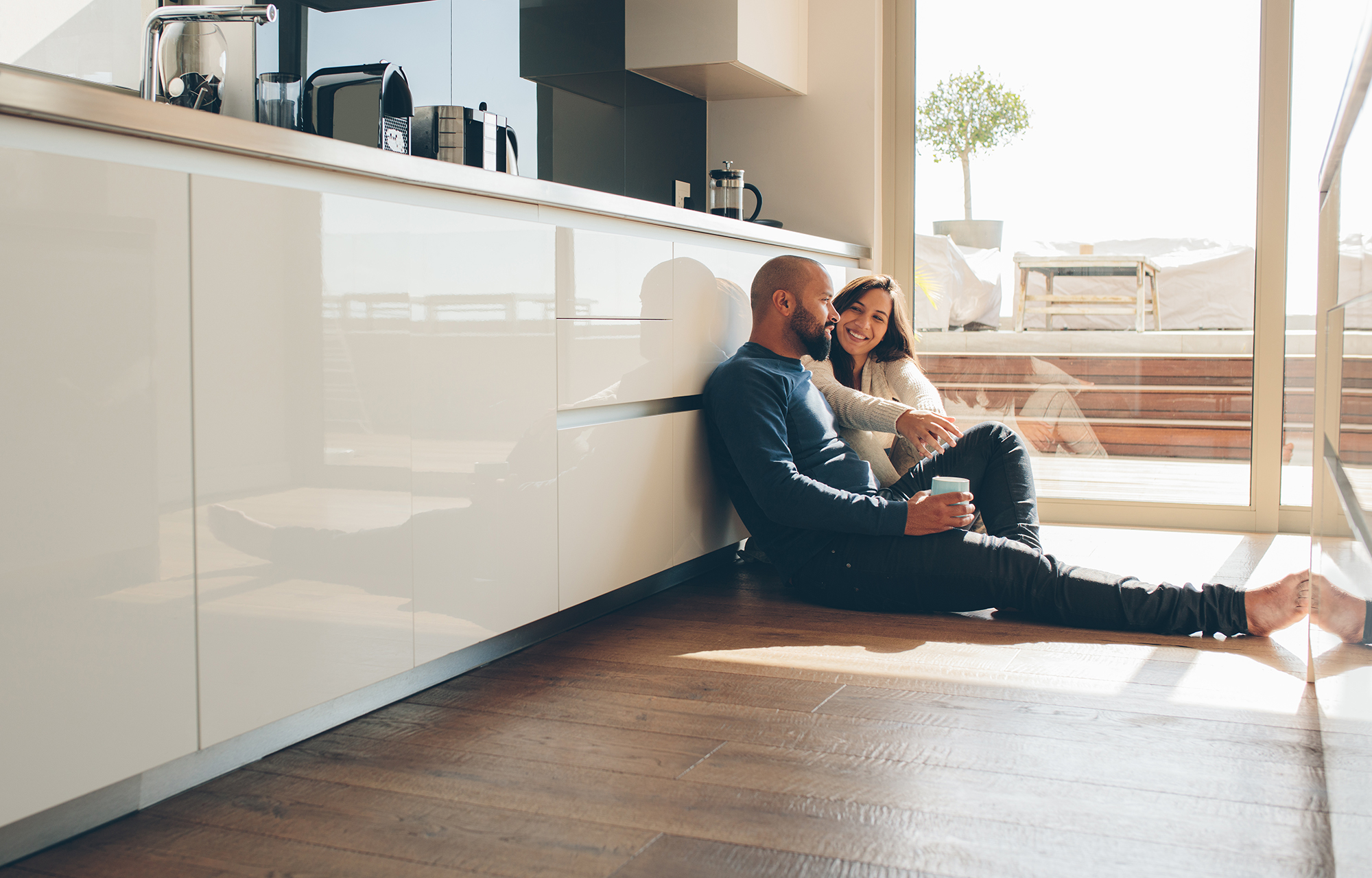
For the better part of five years, cool gray was the answer to nearly every flooring question. Light ash, silvery LVP, bleached-tone hardwood, it was the safe, modern choice and it worked well in a lot of spaces. But it's run its course. What's replacing it isn't a sharp overcorrection into heavy amber territory, it's a more considered return to floors that feel natural, grounded, and livable. The problem is that picking the right warm tone requires more precision than most people realize. Make the wrong call and you can end up with a floor that looks dated before you've even finished decorating.
This is the conversation I walk every client through at Designers Home Gallery when we start talking about warm floors. There are specific undertones that hold, specific pairings that keep things feeling current, and some things about the way light works in Wichita homes specifically that change the decision entirely.
Why Warm Tones Are Moving Differently This Time
The warm floors making the biggest impact right now aren't the amber-heavy, orange-tinted hardwoods from two decades ago. They sit in a different register, soft toffees, muted honeys, warm caramels, and deeper brown-toned walnuts. These are tones with real complexity, where the grain has variation and the overall effect reads as natural rather than saturated. The shift reflects something broader happening in home design right now: people are choosing materials that feel authentic and well-made over materials that photograph well and age fast.
In Wichita homes specifically, this shift is showing up most strongly in main living areas and open-concept kitchen-to-living transitions. Clients who've made this move over the last year consistently describe the result the same way, the space finally feels like it has a foundation. Cool gray floors have a way of making rooms feel unfinished, like they're still waiting for something. The right warm tone resolves that.
The Undertone Is the Whole Decision
Warm doesn't mean the same thing across every floor sample. A plank with a red-orange undertone will age very differently than one with a brown or gray-brown base, even if they look nearly identical on a chip under showroom lighting. This is where most people make the mistake, they fall in love with a sample in-store, bring it home, and find it reads completely differently against their actual walls and trim. The undertone is what drives that shift.
The floors holding their visual appeal longest right now have a brown or gray-brown base. Think soft honey rather than sharp amber, or a walnut that reads brown-rich rather than red-rich. For tile in warm tones the same principle applies, a muted sand or greige with subtle surface variation will remain elegant in five years in a way that a fully saturated terracotta won't. When you visit Wichita, KS, always pull samples into natural light before you commit. The difference is immediately visible.
How Kansas Light Changes the Calculation
This is something we bring up with almost every client across Wichita, Derby, Andover, Maize, and Eastborough, and it genuinely changes which floor is the right call for your home. Prairie light in Wichita tends to run bright and warm, particularly in south- and west-facing rooms during the afternoon. That's a very different light environment from the diffused northern light in most European design photography, where a lot of the warm-tone imagery that's trending right now was shot. A floor that reads as a calm, warm neutral in those images can look startlingly orange in an afternoon Wichita kitchen.
The practical takeaway is that you may need to go slightly cooler in undertone than your instinct suggests. A floor with gray-brown complexity will read as warm in your space without overcorrecting, the Kansas afternoon sun does the work of warming it up naturally. If there's any doubt, Designers Home Gallery offers in-home consultations where we bring samples to your actual space and let real light tell you what works. It's worth the extra step before making a permanent flooring decision.
What to Pair It With So It Doesn't Become a Time Stamp
The way a floor dates a room is rarely the floor alone, it's the combination. Orange-toned hardwood from 2005 looks dated primarily because it was almost always paired with dark espresso cabinets and warm-painted walls, and that trio belongs to a very specific design moment. A warm floor today, paired thoughtfully, can look just as current in 2030 as it does right now.
What's working well alongside warm floors right now is warm whites on the walls rather than the cool blue-toned whites, natural wood accents that match in temperature, and hardware in matte black or unlacquered brass. Avoid pairing a warm floor with the gray-tinted whites that were popular five years ago, that temperature mismatch reads as an accident rather than a choice, and it can make a genuinely beautiful floor look like a mistake. Get the pairing right and the whole room holds together long-term.
At Designers Home Gallery, we help homeowners across Wichita, Derby, Andover, Maize, and Eastborough choose floors that look great immediately and hold their appeal for years. Stop by Wichita, KS to see our full range of hardwood, engineered wood, and tile in warm tones, and work with one of our designers to find the right match for your space. Ready to get started? Contact us today to schedule your in-home consultation.