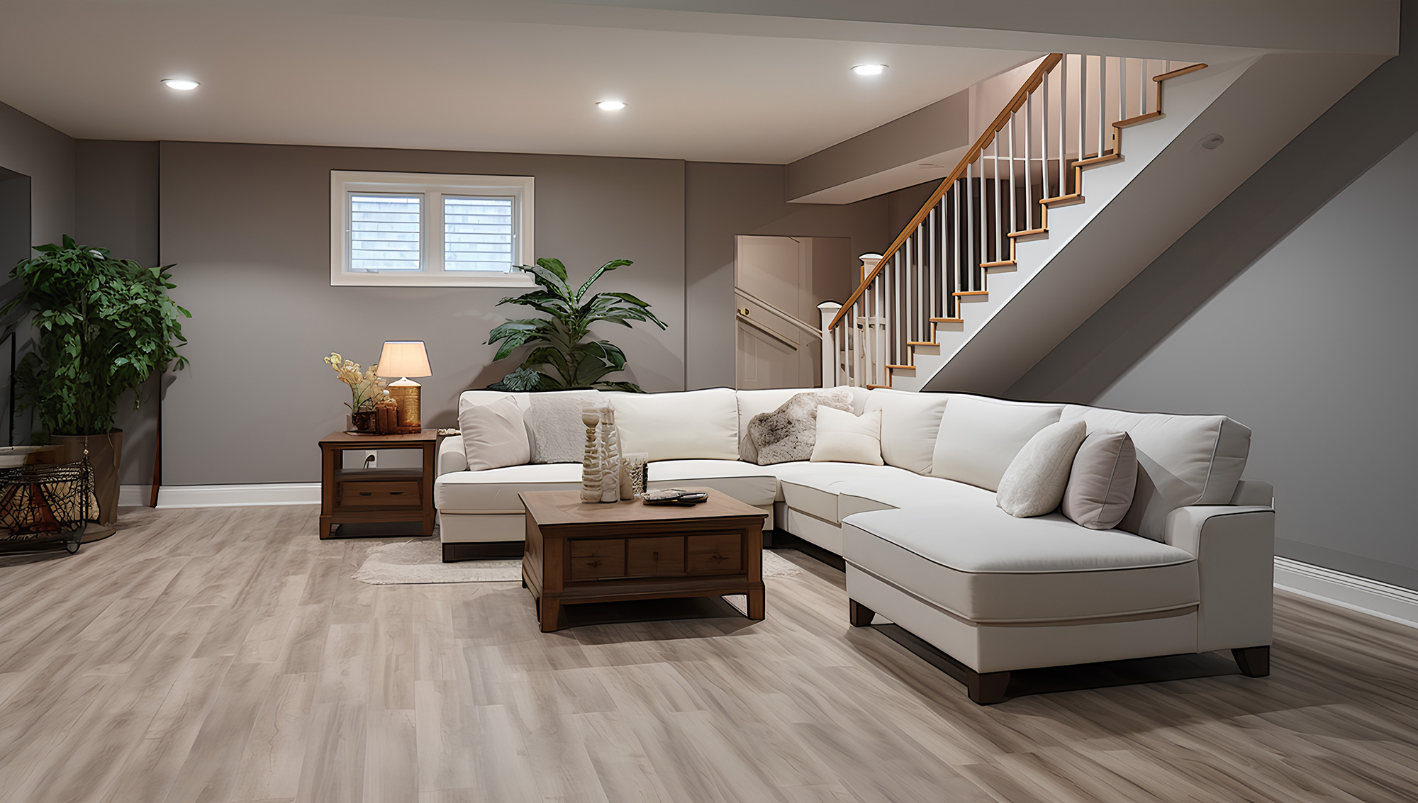
If you’ve ever painted a room “safe greige” at 10 p.m., gone to bed feeling victorious, then walked in the next morning and thought, Why does this look… pink?, welcome. The clash usually isn’t the paint color. It’s the floor undertone arguing with your light source, your trim, and the direction your windows face.
At Designers Home Gallery, we see this constantly in Wichita homes, especially when people are updating flooring in stages. If you want to see undertones in real lighting before you commit, bring photos and a paint deck when you visit us at Wichita, KS.
Step 1: Identify the undertone family
“Greige” is a marketing blanket. What matters is the undertone family your eye keeps missing:
Warm (yellow/golden): reads cozy, but can turn paint greenish if the paint has a cool base.
Red/pink: common in some stains and natural species; can make “neutral” walls look peachy.
Cool (blue/gray): looks crisp, but can make warm whites look dingy or “nicotine.”
Green/olive: often shows up in certain beiges, taupes, and some stone looks; can make gray paint look muddy.
Hardwood undertones come from the species (oak vs maple vs hickory), the stain base (yellow/red/neutral), and the finish sheen (matte hides glare; satin can amplify warmth). Tile undertones come from the visual print, glaze, and how grout frames the color.
Step 2: Use lighting math
Two rooms can have the same paint and the same floor and still look different because of:
Bulb temperature (Kelvin):
2700K–3000K warms everything (often reveals yellow and red undertones).
3500K is more neutral (good for testing true color).
4000K–5000K can pull floors cooler and make warm paint feel flat.
Window direction:
North light is cooler and can make warm floors look dull.
South light is warmer and can make warm floors go extra honey.
East/West can swing wildly morning vs evening.
Designer trick: test samples at three times (morning, afternoon, night) and under the same bulbs you’ll live with. Not showroom lighting. Not phone flashlight lighting.
Step 3: Watch for metamerism
Metamerism is when two materials match under one light source and clash under another. It’s common with:
Gray-beige paint + wood-look tile
Warm white walls + cool gray LVP/tile
Neutral stains + bright LED lighting
How to beat it: create a mini palette board at home. Tape together:
paint sample, 2) floor sample, 3) cabinet/trim sample (or a photo), 4) countertop sample (or photo), 5) a strip of your rug/textile color. Then view it under daylight and evening lighting.
Step 4: Undertone pairing rules that actually work in Wichita homes
These are reliable, “don’t-make-your-brain-tired” pairings:
Warm oak / honey hardwood: pair with warm whites and true taupes (not icy grays).
Cool gray tile or cool-stained hardwood: pair with clean whites and cool neutrals; avoid creamy paints that turn yellow-green.
Red/pink undertone woods: avoid “pink-friendly” beiges; go balanced taupe or soft warm gray to calm the red.
High-contrast grout: treat grout like a frame. Dark grout makes tile look busier; matching grout makes it calmer.
Also: sheen matters. If you hate seeing every footprint, don’t pick a high-sheen finish and then blame the color.
Step 5: The checklist before you buy paint or floors
What direction do my main windows face?
What Kelvin bulbs do I use in this room?
Is my floor undertone warm, cool, red/pink, or olive?
Is my trim warm white or bright white?
Will this floor run through multiple rooms (open concept = more light interactions)?
Am I choosing a grout that adds contrast I’ll feel every day?
If your home keeps drifting into “why does this look off?” territory, it’s usually a systems problem: undertone + lighting + finish + grout, all stacking up. Designers Home Gallery can help you build a palette that looks right in Wichita daylight and still feels calm at night.
Ready to stop guessing? Visit or contact Designers Home Gallery to view real hardwood and tile samples and build a matched plan for your home across Wichita, Derby, Andover, Maize, and Eastborough. And if you’re near Wichita, KS, come in with your paint swatches and a few photos, we’ll help you troubleshoot fast.