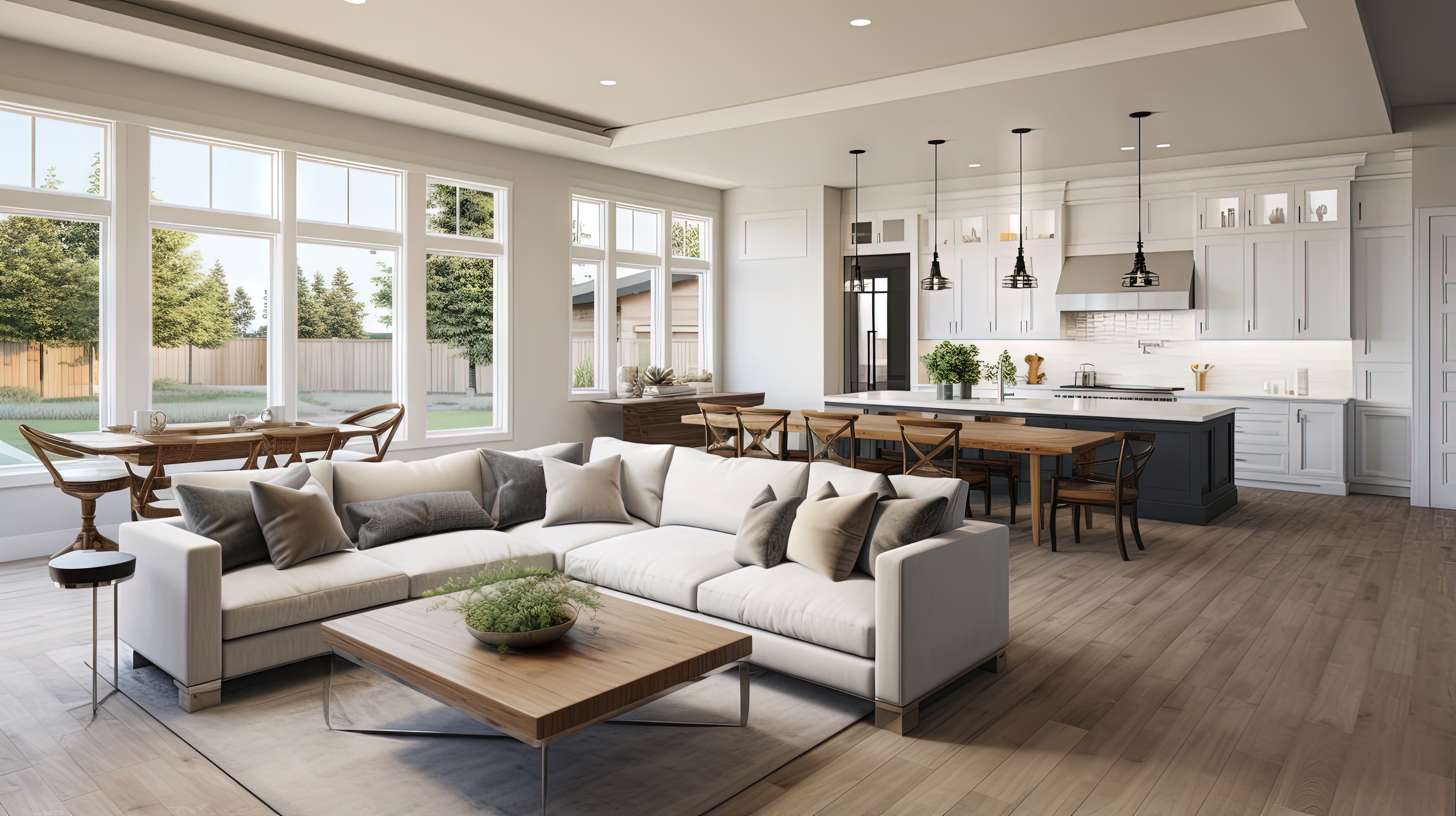
Homeowners often choose hardwood based on a small sample and a quick reaction like “that looks warm” or “that looks modern.” The problem is that hardwood covers a large visual surface area. Once installed, it becomes one of the strongest color signals in the room, and it stays there through every furniture update, rug change, wall repaint, and seasonal lighting shift.
The most common mistake is choosing a floor color that is too specific in undertone. A hardwood floor with a strong orange cast, heavy red influence, or cool gray wash can lock the room into a narrow styling lane. That makes it much harder to pair the floor with sofas, wood furniture, cabinetry, and accent materials without visual conflict.
A flexible floor tone does not need to be boring. It needs to be balanced.
The real issue is undertone, not just light or dark
Most homeowners think in terms of light floors versus dark floors. Designers look first at undertone. Undertone is the subtle color beneath the main stain or finish appearance. In hardwood, that usually shows up as:
Yellow-gold
Red-brown
Orange
Pink-beige
Taupe
Neutral brown
Gray-brown
Two floors can look similar in depth but behave completely differently in a furnished room because of undertone. For example, a medium brown floor with orange-gold undertones can fight against cooler upholstery, black metal accents, and soft white walls. A medium neutral brown floor with lower chroma will usually accept a much wider range of finishes and furnishings.
That is why the best “flexible” hardwood tones are often the ones that feel grounded rather than dramatic.
Why furniture gets harder to style when the floor tone is too aggressive
When a floor has a dominant undertone, every wood piece placed on it has to be considered more carefully. Dining tables, coffee tables, media units, and sideboards can suddenly look too red, too yellow, or too ashy against the floor.
The issue is not that all woods need to match. In fact, exact matching often looks flat and overly staged. The problem is incompatible temperature and saturation. If the floor is heavily warm and the furniture is muted or cool, the contrast can feel accidental instead of layered.
This also affects:
Area rugs, especially cream or beige tones that may pull pink or yellow
Upholstery, which can appear dull or cold against the wrong floor
Wall paint, especially whites that shift under natural and artificial light
Cabinet finishes in adjacent spaces
Decorative accents like brass, black iron, and stone
A flexible hardwood tone gives the homeowner more freedom over time. That matters because most people keep flooring longer than they keep furniture.
What usually works best in real homes
In most homes, the most adaptable hardwood colors fall into a restrained middle zone. They are not overly dark, not washed out gray, and not strongly orange. They tend to have a neutral-to-soft-warm base that works with both classic and updated interiors.
Good flexible characteristics often include:
Low to moderate color variation
Controlled warmth rather than obvious yellow or red
Matte or satin finish instead of high gloss
Grain character that feels natural without becoming visually busy
White oak is popular for this reason. It typically offers a more muted, balanced base than red oak and takes stain more quietly. That does not mean white oak is always the answer, but it often gives homeowners more room to evolve their interior style without fighting the floor.
Why sheen matters almost as much as color
A floor’s finish level changes how color reads throughout the day. Higher gloss reflects more light and can exaggerate undertones. It also highlights dust, micro-scratches, and surface irregularities. That can make the floor feel louder than intended.
Matte and satin finishes usually make hardwood feel more current and more forgiving. They soften reflectivity and allow the wood character to read more naturally. For homeowners trying to build a calm, layered interior, this can be the difference between a floor that supports the room and a floor that dominates it.
How to test hardwood color the right way
The safest approach is to test flooring with the rest of the room, not in isolation. A hardwood sample should be viewed with:
Existing or planned cabinet color
Upholstery fabric or sofa color
Paint swatches
Metal finishes
Natural daylight and evening lighting
It is also important to view a larger sample whenever possible. Tiny boards hide the true visual weight of color and grain repetition. What looks subtle in your hand can become much stronger across an entire room.
Choose a floor that stays useful, not just impressive
Trend-driven stains may photograph well today but feel limiting later. A flexible hardwood floor is a long-term design asset. It should make decorating easier, not turn every furniture decision into a correction exercise.
At Designers Home Gallery, we help homeowners across Wichita, Derby, Andover, Maize, and Eastborough compare hardwood tones in a practical way, with attention to undertone, finish, daily use, and long-term styling flexibility. Visit Wichita, KS to explore options in person and get expert guidance for your space. When you are ready to choose hardwood that works with your home instead of against it, contact us.