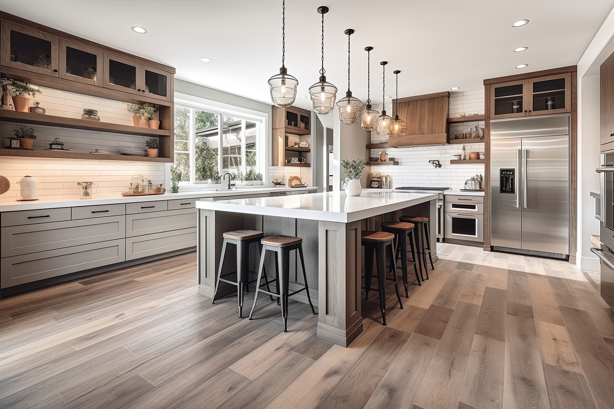
When you’re creating a home that feels warm, intentional, and beautifully layered, mixing wood tones is one of the most powerful design tools you have—if you do it right. Done well, it adds depth, dimension, and a sense of curated character. Done poorly? It can make a room feel like a mismatched thrift-store haul.
At Designers Home Gallery, we help homeowners navigate this exact design challenge every day in our showroom at Wichita, KS. Whether you’re pairing new hardwood flooring with existing furniture or updating multiple rooms at once, mixing wood tones doesn’t have to feel intimidating. With a few designer-tested guidelines, you can create a space that’s cohesive, inviting, and far from chaotic.
Start With Your “Anchor” Wood Tone
Every room needs one dominant wood element that sets the tone—usually the flooring. If you're selecting hardwood, consider the overall mood you want:
Light oak or maple for airy, Scandinavian-inspired interiors
Mid-tone hickory or wire-brushed finishes for a warm, lived-in feel
Deep walnut or espresso for richness and visual drama
Once you’ve chosen the anchor, the supporting tones should complement the floor without competing with it.
Use Undertones as Your Roadmap
The secret to mixing wood tones is understanding undertones—the subtle warm, cool, or neutral base beneath the surface color.
Warm undertones: honey, amber, red, or golden notes
Cool undertones: gray, taupe, or muted brown
Neutral undertones: balanced browns with minimal color shift
If your flooring has a warm undertone, pair it with other pieces that lean warm—though not necessarily the same shade. The goal is harmony, not identical twins.
A safe rule:
Match undertones, vary depths.
This gives you contrast without clashing.
Avoid the “Five Shades of Almost the Same” Problem
Here’s where many Kansas homes go sideways. When wood tones are almost the same—but not quite—they fight for attention. The result? Visual static.
Instead, layer intentional contrast:
Light flooring + medium furniture + dark accents
Medium flooring + light cabinetry + dark trim
Dark flooring + mid-tone furniture + light decorative pieces
This creates a balanced gradient that feels curated rather than accidental.
Repeat Each Wood Tone at Least Twice
Design consistency comes from repetition. If you introduce a new wood element, echo it somewhere else in the room:
If your dining table is darker than your floors, repeat that tone in picture frames or shelving.
If your floating vanity is a lighter wood, pair it with matching mirror trim or a coordinating stool.
Repeating tones anchors the palette and prevents any single piece from feeling like an outlier.
Use Texture to Add Dimension
Texture is the unsung hero of mixed-wood design.
Two woods with similar tones can look dramatically different when one is:
Wire-brushed
Hand-scraped
Matte
Satin
Polished
This textural contrast keeps the palette from feeling flat and brings out the natural beauty of your flooring.
Bring Balance Through Non-Wood Materials
Not everything in the room needs to be (or should be) wood. Tile, textiles, metal accents, and paint colors buffer the differences between wood tones.
A few designer-trusted combinations:
Warm oak floors + brushed brass hardware + stone-look tile
Dark walnut floors + matte black lighting + cream rugs
Medium hickory floors + soft-grey walls + textured linen upholstery
These elements help your mixed woods coexist gracefully.
Lighting Will Make or Break Your Wood Palette
Kansas homes experience big lighting shifts throughout the day—especially in open-concept layouts. What looks balanced at 10 a.m. may skew red, yellow, or ashy by evening.
This is why we always recommend bringing wood samples home and observing them in natural, artificial, and nighttime lighting before making a final decision.
When in Doubt, Visit a Designer for a Floor + Furnishings Match
Even seasoned DIY decorators get stuck pairing existing furniture with new floors. Bringing a few photos—and any wood swatches you have—into Designers Home Gallery helps us guide you toward tones and finishes that work together beautifully.
Mixing wood tones isn’t about matching—it's about balancing. Choose an anchor tone, understand undertones, create intentional contrast, and repeat each shade with purpose. With these principles, your home will feel cohesive, warm, and thoughtfully designed.
If you’re ready to explore hardwood options or want help matching your existing wood pieces, visit us at Wichita, KS or give us a call. Designers Home Gallery proudly serves homeowners across Wichita, Derby, Andover, Maize, and Eastborough with designer-selected flooring that elevates every room.